
Guide
Designing Pharmacies and Opticians' Shops that Sell More without Lowering Prices
Subscribe to our newsletter!
Pharmacies and opticians have a problem that isn't related to the product itself: everyone has the same product. Online pharmacies sell the same Panadol. Amazon has the same frames. Price will always be an argument against brick-and-mortar stores.
Except when a physical establishment offers something a screen can't replicate: an experience. A space where someone looks you in the eye, understands your problem, and provides a solution. And that experience begins with the design of the space.
The real problem of healthcare retail in Madrid
The online channel captures the pure prescription product market. What it can't capture is the skin consultant who understands skin type and recommends three products instead of one, or the optician who detects in 10 minutes that the customer needs progressive lenses and not the reading glasses they were going to buy. The design of the space can greatly facilitate or hinder each of these interactions.
- Pharmacy with retail design focused on dermocosmetic advice: average ticket €42 vs €18 without specific design
- Optician with premium advice area: visit to sale conversion 68% vs 41%
- Pharmacy with separate parapharmacy area: sales per linear meter +35%
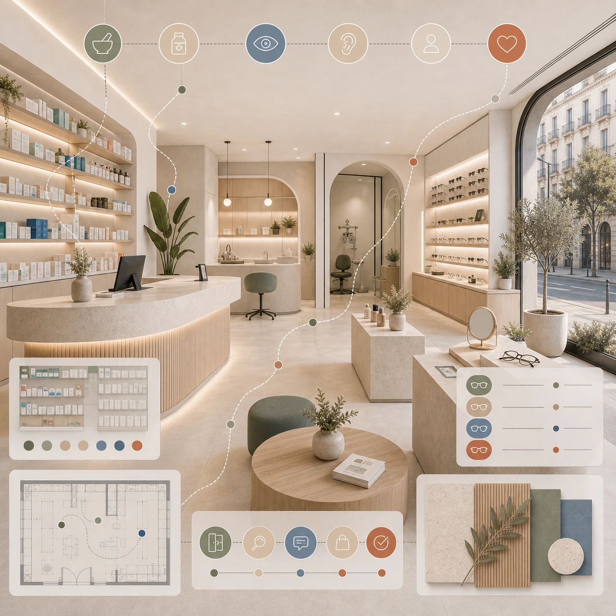
Pharmacy design: from dispensary to health space
The model that is winning in Madrid
- Dispensary pharmacy (losing model): Long counter separating customer from pharmacist, product on shelves behind the counter, customer orders and pharmacist gives — Average ticket: €14-€22
- Health and wellness pharmacy (winning model): Free-flow area with accessible pharmacy, separate personal advice area, and dedicated dermocosmetics consultation area — Average ticket: €38-€65
Key design difference: In the winning model, the customer can touch, explore, and discover. In the dispensary, they can only order.
Critical design elements in premium pharmacies
1. Free access and parapharmacy display area
A well-displayed pharmacy sells itself if customers can easily approach, pick up, and read the label. Well-designed, easily accessible shelving ensures a maximum product height of 150-165cm, a minimum aisle width of 90cm, focused and warm lighting for each product area, clear signage by category, and dedicated space for featured products with their own branding.
Pharmacy furniture budget: €8,000–€18,000 (for every 30m² of free access area)
2. Dermo-advice area: the most profitable m²
The skincare consultation area is the most profitable square meter in a well-designed pharmacy. The skincare consultant spends 4-8 minutes with each client (vs. 90 seconds at the counter), the average recommendation is 2.4 products vs. 1.1 at the counter, and the profit margin for skincare products is 35-55% vs. 18-25% for medications. Design it as follows: a semi-private space separate from the counter, a table or low counter that allows for close interaction, lighting with a mirror that allows for a clear view of the skin, and organized and easily accessible product testers.
Dermocosmetic advice area budget: €4,500–€9,000
3. The counter: from barrier to welcome
A well-designed pharmacy counter in 2026: it doesn't have to be continuous (differentiated service points), accessible height at some point of 90cm, material that communicates care (wood, microcement, not catalog Formica), without accumulation of advertising on the counter.
Budget for renovated pharmacy counter: €6,000–€14,000
4. Signage: the silent salesperson
Signal by symptom, not by generic category. Instead of "Vitamins / Hygiene / Dermocosmetics," use "For the skin / For energy / For sleep / For sports." A customer with a problem is better guided by symptom than by pharmaceutical category.
Pharmacy signage budget: €2,500–€5,500
Optical design: where image is everything
1. Mount display: the difference between collection and warehouse
Common mistake: all frames on display without any curated selection. The customer arrives, sees 400 frames, and experiences decision paralysis. A well-designed optical shop: a curated selection of 100-150 styles (not 400), grouped by style/personality, focused lighting on each frame, and a well-lit mirror for trying them on. Customers who can comfortably try on frames buy at higher prices and more quickly.
Premium display frame quote: €12,000–€24,000
2. The graduation room: from dark room to premium space
The examination room in most opticians is a functional darkroom. In Madrid's premium opticians, it's a well-designed space. Customers spend 20-40 minutes here—it's where they decide whether to buy prescription glasses and where a relationship of trust is established. A well-designed room offers real privacy (door, soundproofing), visible modern equipment, a screen to display results, and comfortable seating.
Premium graduation room quote: €8,000–€16,000
3. Palette and materials: consistency with the product
Eyeglass frames are a fashionable and designer product. The space that sells them should reflect that. Materials that work well in premium optical stores include: white as a base (clean, focusing on the product), wood for a warm contrast, black or gold metal for structures and displays, and stone in fitting rooms and counters. Avoid: visible plastic and generic acrylic.
Actual budgets
Renovated urban pharmacy 80-120m²
- Demolition and layout: €5,500 — Electricity: €7,000 — Flooring: €8,000 — Finishes: €4,500
- Renovated counter: €9,500 — Pharmacy furniture (30m²): €14,000 — Dermo-advice area: €6,500
- Zone lighting: €9,500 — Complete signage: €4,000 — Branding: €5,000
- Project and management: €8,000
- TOTAL: €89,500 — €895/m² — Average ticket: +40-65% — Dermoadvice sale: +120% — Payback: 14-22 months
Boutique optician 60-90m² (new opening or complete renovation)
Total investment: €110,000–€165,000. Projected revenue: 6-8 sales/day × average ticket €380 = €12,000–€15,000/month in frames, plus €6,000–€9,000/month in prescriptions and contact lenses. Total: €18,000–€24,000/month. Payback: 18-28 months.
Most common mistakes in pharmacies and opticians in Madrid
Error 1: Keeping the counter as a total barrier
The counter that occupies the entire interior space prevents the customer from exploring. A customer who doesn't explore doesn't discover. A customer who doesn't discover doesn't buy more.
Error 2: Uniform and generic lighting
Flat lighting makes the product not stand out. In dermocosmetics and eyewear, the product has to look good to sell well.
Error 3: No separate advisory area
A pharmacist who provides advice standing at the counter, in public, and in a hurry, cannot do their job properly. The sale of advice doesn't happen.
Error 4: Overloading the brand advertising space
The space, which resembles a brand showcase, doesn't look like a health center. It looks like a catalog warehouse, the opposite of what professional advice should be about.
Do you own a pharmacy or optician's shop in Madrid and are you thinking about renovating it?
At EOLOS, we design pharmacies and opticians in Madrid geared towards mid-to-high-value customers, with a consultation area and high-margin over-the-counter products. We improve revenue without changing the product. Tell us: available square meters, location, whether it's a renovation or a new opening, and what you want to improve.